 Source: MoveOn.org
Share this:
- Print (Opens in new window) Print
- Email a link to a friend (Opens in new window) Email
- Share on Facebook (Opens in new window) Facebook
- Share on LinkedIn (Opens in new window) LinkedIn
- Share on Reddit (Opens in new window) Reddit
- Share on X (Opens in new window) X
- Share on Tumblr (Opens in new window) Tumblr
- Share on Pinterest (Opens in new window) Pinterest

and it only cost us 5 trillion dollars. what a bargain. at this rate we can implode our economy sometime in 2013. thank you president obama. Perhaps we should have a chart on unemployment figures for both presidents? And maybe a chart for the millions of people who ran out of unemployment and have given up looking for work. I wonder what those numbers would look like?
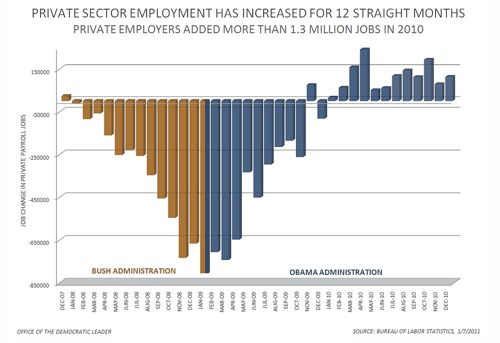
Yeah, might want to check the chart there. It’s cherry picking months that generally have job losses EVERY year from Bush’s term then comparing them with months that usually have job growth EVERY year from Obama’s term. What I’d really like to see is how ALL the numbers stack up quarter by quarter. As it is right now, this is a blatant attempt to make Obama look good in time for the election. Frankly, this graph is dishonest, because it’s designed to mislead people who just casually look at it. I can understand if this was an honest mistake, but if you want to keep your credibility and intellectual honesty, you should either post a disclaimer, or, better yet, take it down completely.
Thinking Enigma,
That this chart so nicely depicts the contrast between the disastrous White-wing Reactionary Constructionist Party’s economic ignorance, and the erudite President Barack Hussein Obama’s economic acumen does not mean that the chart was cherry picked. Albeit you were correct that I should post a disclaimer, and for that I thank you.
DISCLAIMER:
UPDATE
Current Employment Statistics
Bureau of Labor Statistics 01.06.2012
Click to access ceshighlights.pdf
“As of December 2011, the private sector experienced 22 consecutive months of job gains,
recovering 36 percent of jobs lost in the peak-to-trough period from January 2008 to
February 2010.” (Current Employment Statistics, Bureau of Labor Statistics, 01.06.2012, p. 4)
END DISCLAIMER:
Maybe this will clear things up for you:
https://alwaysquestionauthority.wordpress.com/2012/01/26/monthly-change-in-total-private-employment-january-2008-to-december-2011/
In Reason,
Madison